I had a clear vision for the design I wanted, but the initial layout resulted in a lot of empty space, and I struggled to figure out how to arrange the elements effectively to achieve the desired look and functionality.
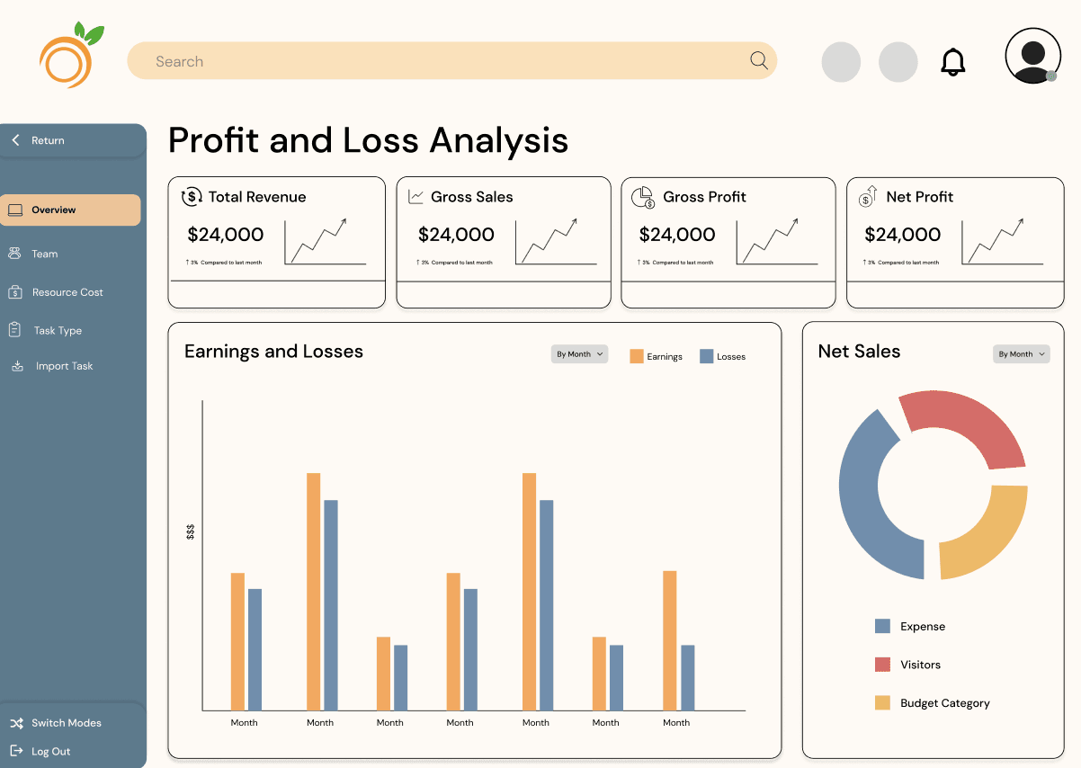
For the iteration, I reorganized the layout to better utilize the available space, redesigned the graph to enhance clarity, and changed the color scheme to align more closely with the company's branding. Additionally, I created a scrolling prototype to visualize the user experience and demonstrate the improved functionality.
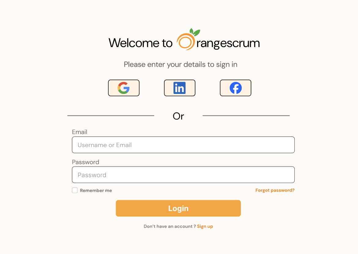
For the sign-in page design, the client requested a more colorful approach; however, the result did not convey a professional appearance. I aimed to balance vibrant elements with a polished aesthetic to ensure the page remains both engaging and suitable for a professional context.
To address the client's request for more color, I showed them examples from other companies that highlighted how simplicity can be the best policy. These examples demonstrated that a clean and straightforward design not only appears more professional but also enhances usability, making it easier for users to navigate and understand the sign-in process. As a result, the iteration is simpler, focusing on a more polished aesthetic that balances vibrant elements with professionalism.
The iteration allowed me to enhance the design to be more intuitive and functional by incorporating a colorful and engaging aesthetic, making the interface more interesting and interactive for users, thereby improving overall user engagement.
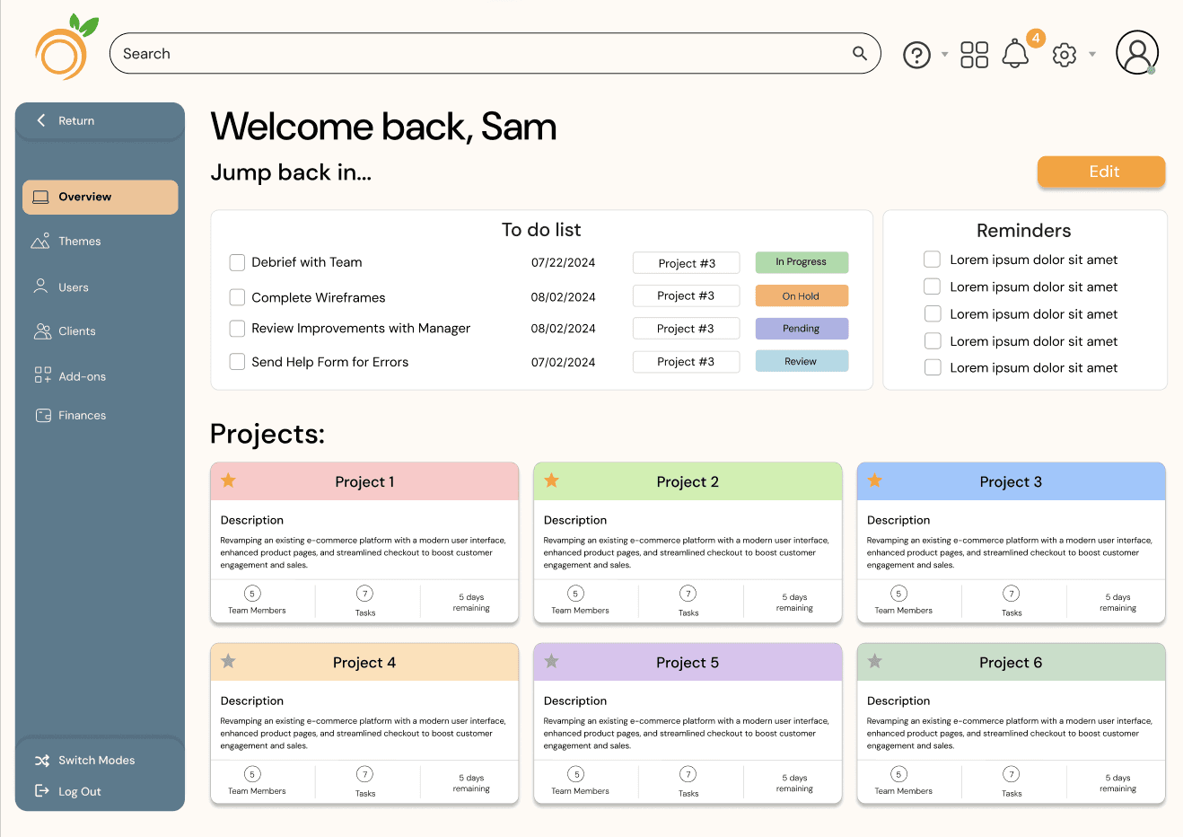
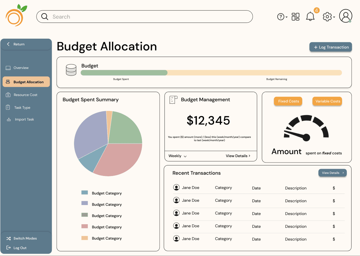
The original design focused on creating a streamlined layout that prioritizes accessibility by prominently displaying all important features on the homepage, minimizing the number of clicks required for users to access key functionalities.
By consolidating essential tools into a single, user-friendly interface, the iteration simplifies the user experience and ensures critical resources are easily reachable, promoting a more productive workflow.


I went through multiple iterations to ensure the design was as simple and user-friendly as possible. Each round focused on improving clarity by refining layouts and resizing elements for better readability. This process helped us create a clean, intuitive interface that enhances the user experience across different screen sizes.
Iterations
Orangescrum
Timeline :
June 2024 - Nov 2024
My Role :
Associate Project Manager
Product designer
Team:
Ruhin Gharai
Tina Nguyen
Rachel Rodolfa
Beatrice Ramos
Simran Gunsi
Type of Product :
B2B SaaS project management
Tools:
Figma
FigJam
Canva
Adobe Photoshop
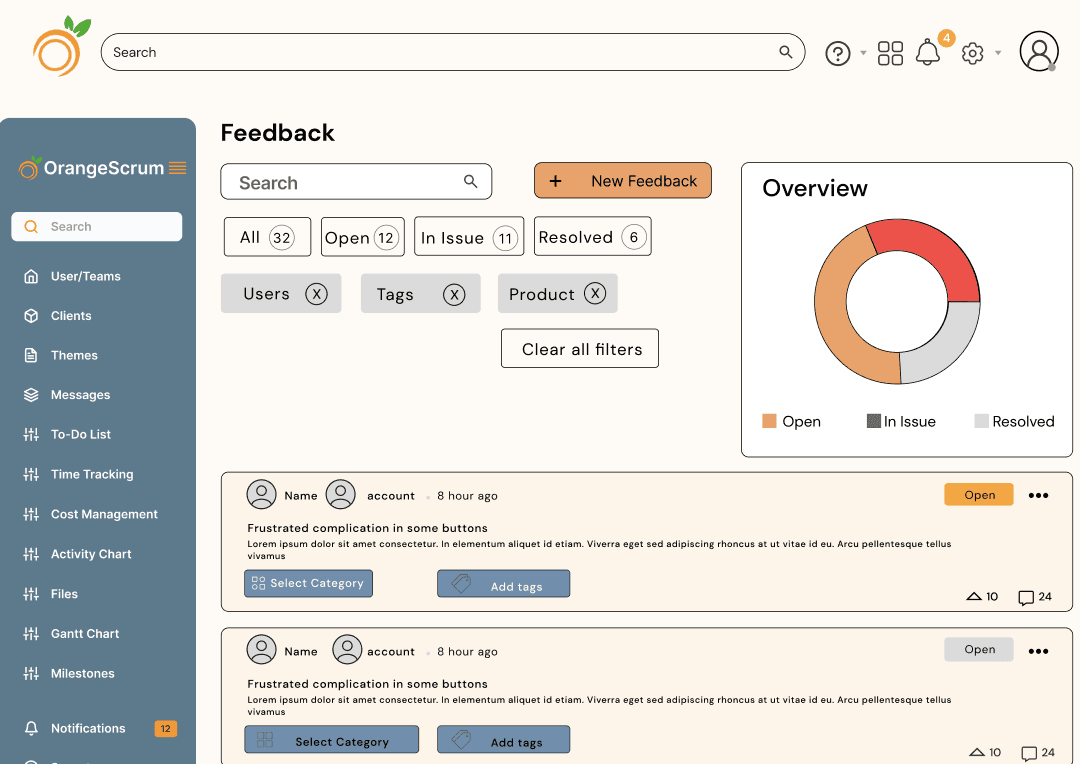
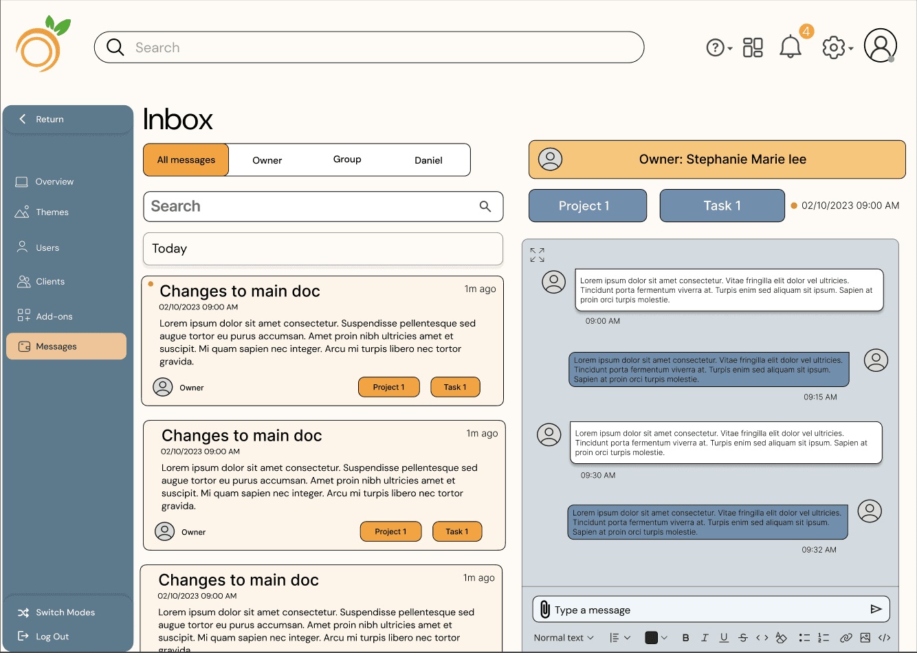
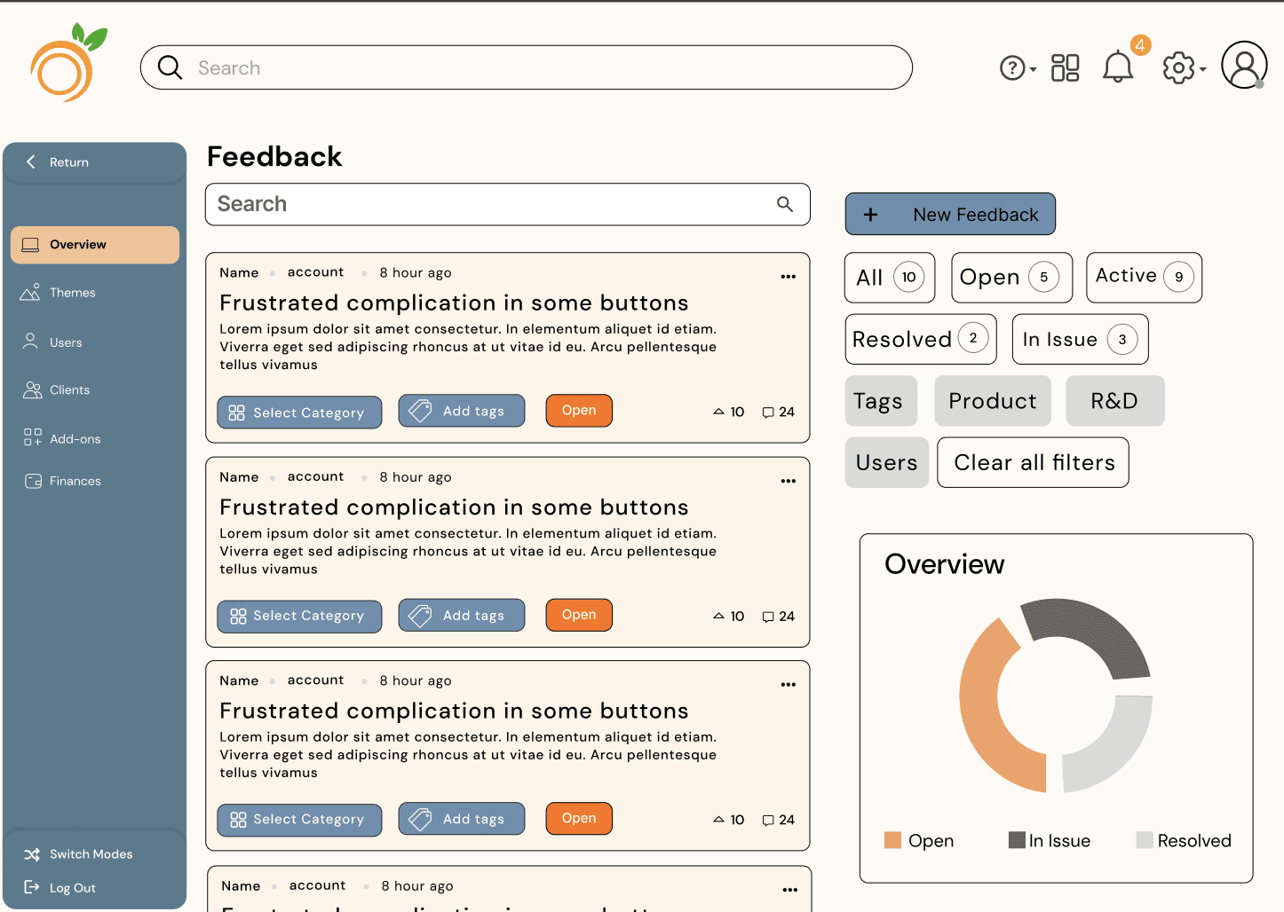
I was tasked with designing an advanced task delegation module for Orangescrum that integrates seamlessly with existing features to enhance user experience. Key elements include a messaging system for real-time collaboration, a reminder system for upcoming deadlines, and a feedback mechanism for managers to assess task progress. I improved the navigation bar for easier access, added a search bar to quickly locate tasks and documents, and streamlined the sign-in and sign-out process on the homepage. This module focuses on automation and user-centric design, making it an essential tool for project managers' daily workflows.
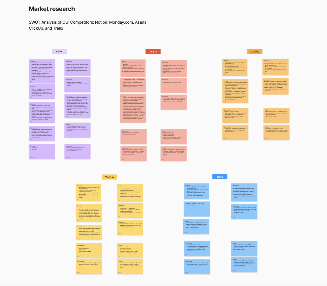
Orangescrum is a comprehensive project management web app designed to enhance collaboration and optimize workflows for teams of all sizes. By providing a centralized platform, Orangescrum enables teams to manage their projects more effectively, ensuring that everyone is aligned and working towards common goals.
These were the key issues identified during my use of the original Orangescrum that needed to be addressed in the redesign:
Confusing Navigation:
The app had only seven navigation buttons with multiple functions, making it difficult to navigate and causing confusion for users.Missing Features:
Essential productivity tools, commonly available in competing project management apps, were absent, limiting its effectiveness for users.Poor Visual Flow:
Excessive empty space and incorrectly sized elements disrupted the visual flow, affecting both usability and the overall user experience.
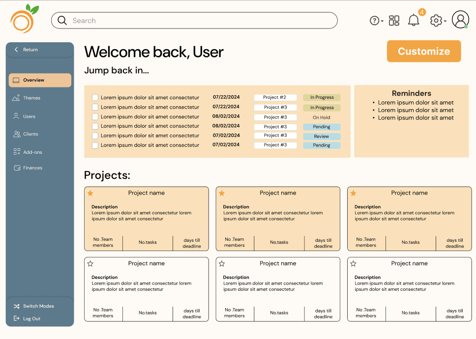
Orangescrum before the redesign

In reflecting on my work on the Orangescrum redesign, this project truly challenged me to think critically about user experience and interface design for B2B SaaS products. Through research, ideation, and multiple iterations, I learned the importance of balancing functionality with aesthetics, ensuring that every feature not only serves its purpose but is also intuitive and visually engaging. Collaborating with my team allowed me to strengthen my leadership and communication skills, while also deepening my expertise in UX/UI design. This project taught me the value of user-centered design, and I’m proud to have contributed to creating a tool that is more user-friendly, visually appealing, and equipped with essential project management features.
This experience has enhanced my ability to tackle complex design challenges, and I look forward to applying these learnings to future projects.
Reflection

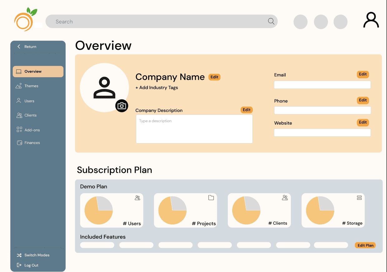

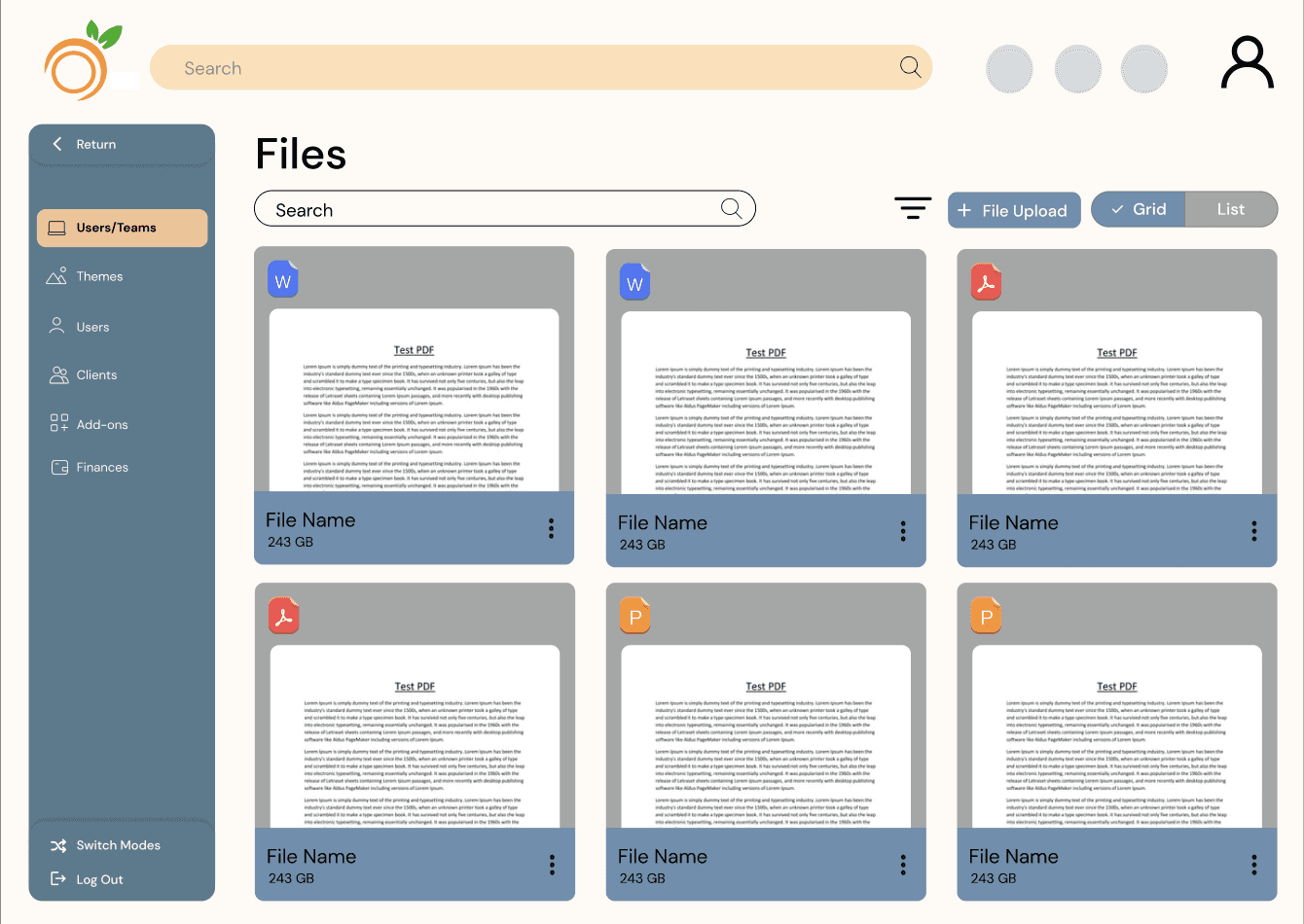

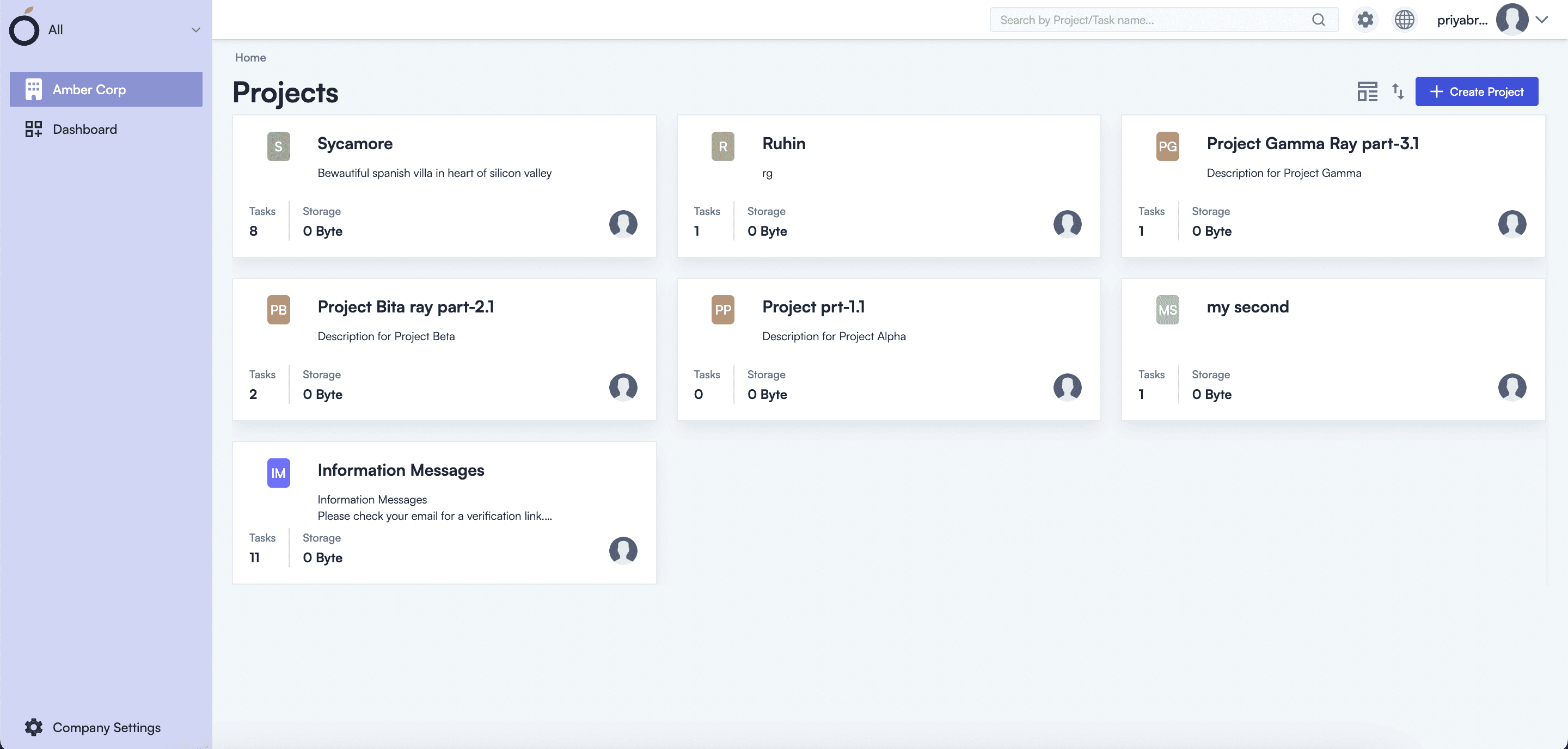
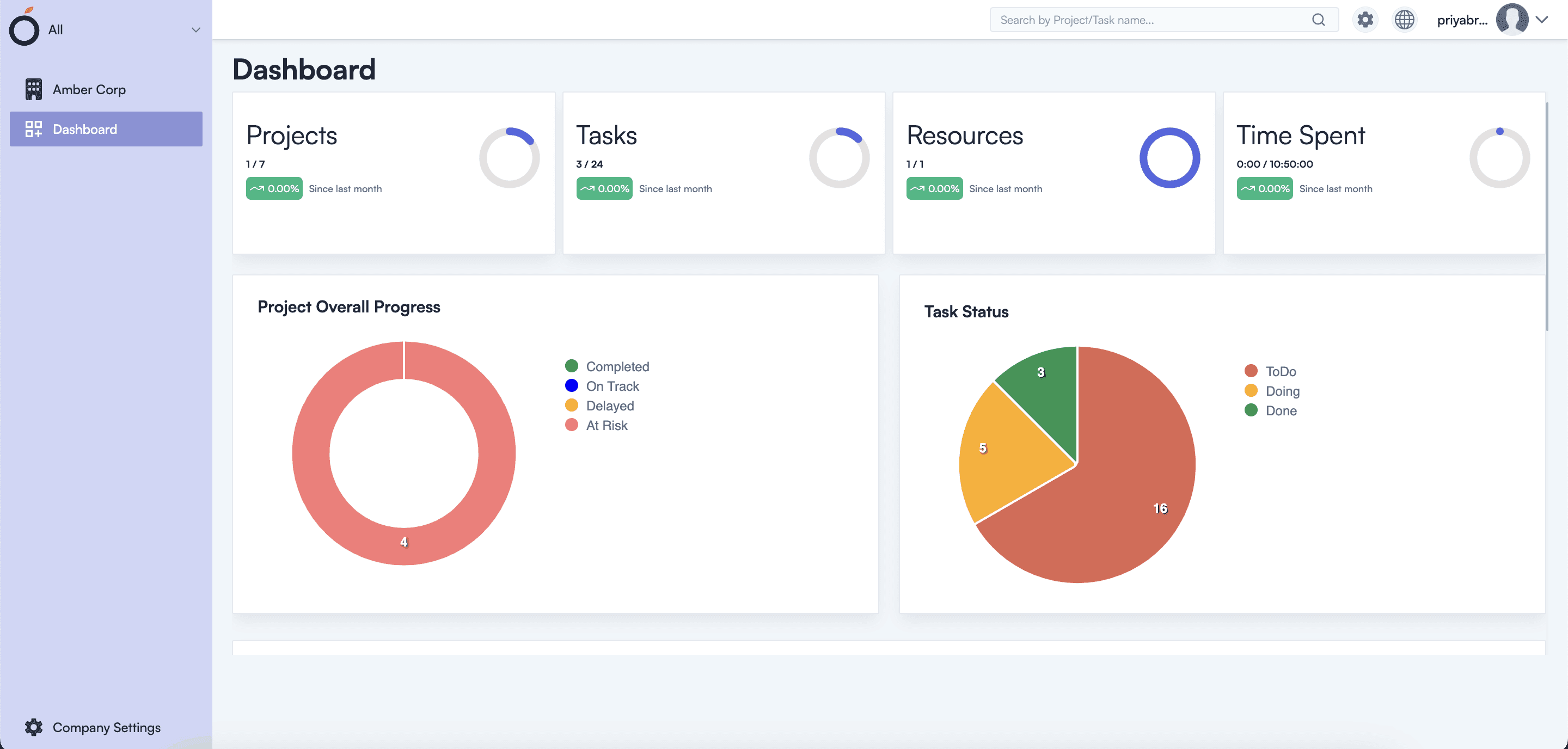
Final Product


My teammate and I crafted the design system, focusing on high modernist accents within minimalist flat containers. This approach embodies Orangescrum's ethos, merging innovation and simplicity to create a seamless user experience. The logo conveys professionalism, while the color palette combines soft tones with vibrant accents. We selected a modern sans-serif font for readability, and the button design features rounded edges and high contrast to enhance interaction feedback.
Design System


Low Fidility
For our initial mockups, we concentrated on two key objectives: layout and shape language. Our aim was to maximize information efficiency within each screen while ensuring clarity and a cohesive visual style. This approach helped us effectively convey the essence of the abstracted data and enhance the overall user experience.
We allowed users to test the original Orangescrum before we began sketching for the redesign, and these were the common insights we gathered from their feedback:
Intuitive Access: Some features are buried in menus, preventing easy access and slowing down interactions.
Customization Needs: Users prefer more customizability in dashboard metrics and priorities over fixed options, allowing for tailored project management.
Readability Issues: Increased font and graph readability is needed, as low contrast and small text hinder user experience.
User Insights
These were the three key points we identified for integration in the redesign based on the competitive analysis of the top five project management tools:
Simplified Task Management:
Focused on clear task prioritization and summaries, ensuring users can easily track project progress at a glance.Customizable Dashboards:
Orangescrum offers adaptable interfaces to suit various business needs, allowing users to tailor dashboards according to their project management style.Centralized User Interfaces:
Orangescrum aims to reduce the number of steps between tasks, minimizing clicks and improving workflow efficiency.