Problem Statement
The Goal
"The Orangescrum project management tool's logo did not fit the brand name and failed to convey a corporate vibe, which undermined the product's professional appeal. This lack of alignment between the logo and the brand identity detracted from the overall perception of the tool. Our redesign sought to create a logo that better reflects the essence of Orangescrum, enhancing its visual identity and making it more suitable for the target audience."
"The solution for the logo was to retain the vibrant orange color that represents the brand while transforming it to convey a more corporate look. This redesign aimed to align the logo with the professional image of Orangescrum, ensuring it resonates with the target audience while still reflecting the brand's energetic essence."
My Role
UX Designer
UX researcher
Team
Ruhin Gharai
Tina Nguyen
Rachel Rodolfa
Beatrice Ramos,
Simran Gunsi
Tools
Canva
Adobe illustrator
Adobe photoshop
Time Frame
3 months ( April 2024 - June 2024)
“The new Orangescrum logo is a game-changer! It perfectly captures our brand’s evolution and resonates with our professional image. We’re thrilled with the outcome.”
— Kallala giri, Digital Marketing Specialist
"The logo redesign exceeded our expectations. It’s not only visually striking but also aligns perfectly with our brand’s mission and values. We couldn’t be happier with the result."
— Jayadev Das, Chief Operating Officer
Client comment

Final Product
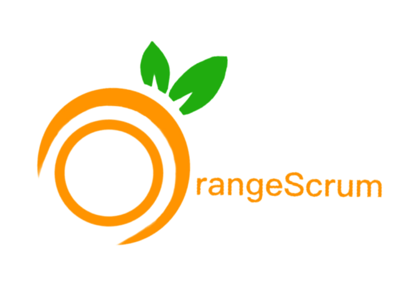
The redesigned Orangescrum logo features a sleek and modern design that better reflects the company's innovative spirit and professionalism, moving beyond the simplicity of the old black circle and orange leaf.


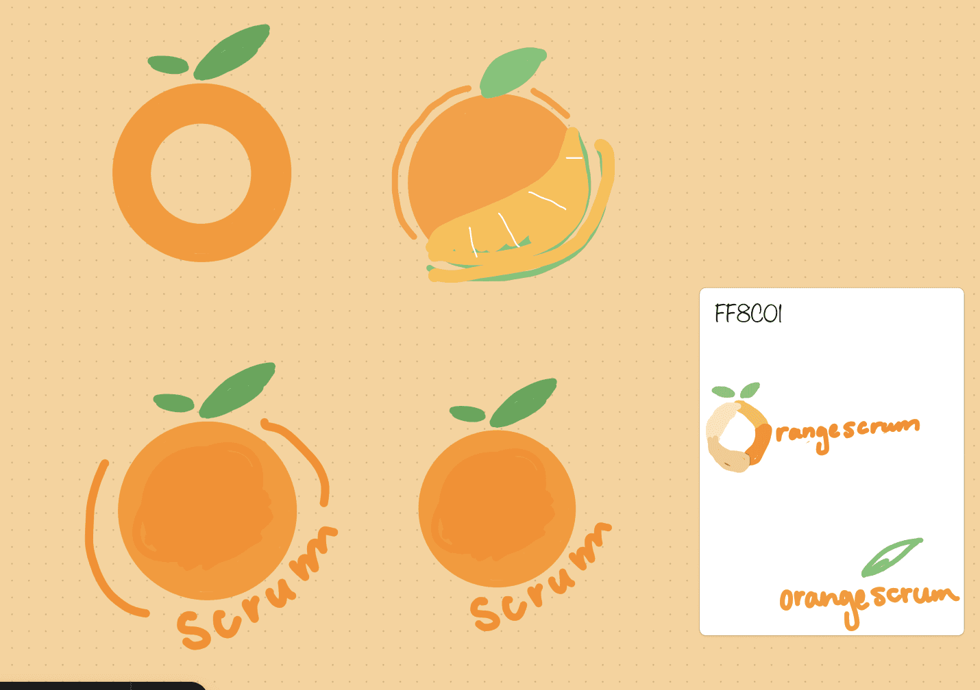
Sketches are crucial for the Orangescrum logo redesign as they allow us to explore different concepts and visual elements, ensuring we capture the brand's identity and values before finalizing the design. They provide a foundation for refining the logo to align with the company’s professional image and goals.
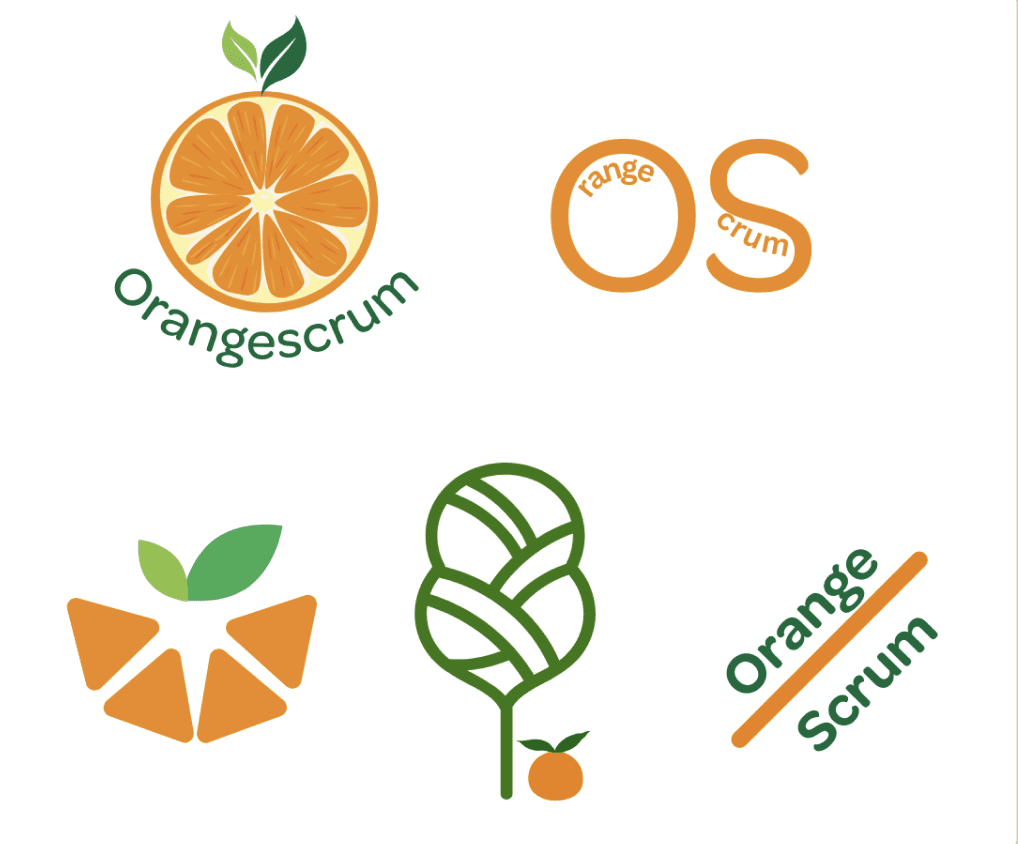
High-fidelity iterations are crucial for the logo redesign as they refine the visual details and color schemes of our concepts, helping us to perfect the logo’s design and ensure it effectively represents the brand's identity. These iterations provide a clearer view of how the logo will appear in various contexts, enabling us to make informed adjustments before finalizing the design.
Ideate
We began the redesign process by sketching and brainstorming ideas to create a more corporate and representative logo for Orangescrum. Our team explored various concepts, focusing on incorporating elements that conveyed professionalism, innovation, and the tool's advanced features. After numerous discussions and iterations, we developed several design options that better aligned with the company's modern and dynamic identity. Here are the final designs we crafted to reflect Orangescrum’s commitment to cutting-edge project management solutions.

Orangescrum before the redesign
The old Orangescrum logo featured a basic black circle with an orange leaf, which many felt was too simplistic and failed to capture the company's innovative spirit. The design did not reflect the advanced features and modern approach of the project management tool, leaving the company seeking a more dynamic and representative visual identity.
Reflection
The redesign process allowed us to elevate the brand’s identity, resulting in a logo that not only aligns with the company’s values but also stands out in a competitive market. The evolution from initial sketches to the final high-fidelity design underscored the importance of iterative refinement in achieving a polished and effective brand representation.
The redesign of the Orangescrum logo transformed it from a simple black circle with an orange leaf into a vibrant, multifaceted symbol that better represents the company's essence and values. Initially, the logo's minimalistic design lacked distinctive features and failed to convey the full scope of Orangescrum's innovative project management solutions. Through the redesign, we created a more dynamic and engaging logo that captures the company's commitment to creativity and efficiency, incorporating elements that reflect its modern, user-centric approach. This new logo not only enhances brand recognition but also aligns with Orangescrum's mission to deliver comprehensive and visually appealing project management tools.